 |
|
|
News
About Us
Membership
Events
Links
|
Collecting on a shoestring: till receipts
Graham HudsonIntroducing a new series of articles for ephemerists collecting on a small budget It was after purchasing something
at my local Cats Protection shop
that I happened to glance at the
receipt and noticed the delightful
little cat logo 
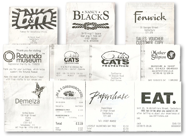
1. A selection of graphically interesting receipt headings from the authors collection. After that I was hooked and my collection of graphically interesting till receipts now numbers several dozen. A particular virtue of this ephemera is that much of it arrives as a bonus to some necessary purchase and is thus completely free - the ideal for the shoestring collector. The collector may also be assured that he is in good company, for till receipts are among the contemporary items actively collected by the Centre for Ephemera Studies at Reading University. At present there are more purely utilitarian receipts in use than visually interesting ones, and it surprising how many national institutions and private businesses whose functions or titles beg for graphic treatment get by with nothing better than plain print. Among them are institutions such as the Royal Opera House, Covent Garden, the Tate Gallery and the Turner Contemporary at Margate; and small businesses trading under such highly pictorial names as Poppies, Friars Head and Company of Cooks. Such organisations will catch up in time I hope, but meanwhile paucity adds to the thrill, for one never knows what goodie may or may not turn up when visiting a different retailer or coffee shop. It is also worth remembering that friends and relatives holidaying far from ones home territory can return with material that might otherwise be missed.
Even with a store or coffee shop
you know well it is worth checking
the receipt for designs do change
from time to time as has happened
with Asda, Lakeland, and Dunhelm
Mill, the latter when it recently
reduced its name to Dunhelm. Till
receipts come in different widths
depending on the machine that
prints them and if branches of the
same organisation use different
machines the results can be intriguing,
as witness what happened to the kitty when the Cats Protection
design was stretched to 78mm
from its originally designed width
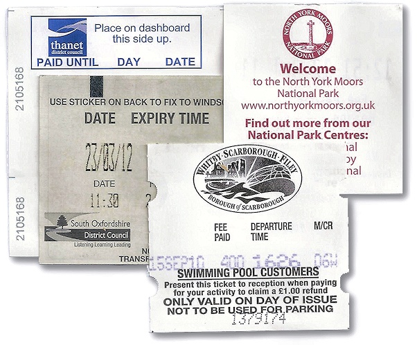
of 57mm For me, collectable receipt headings fall into three categories: typeface italicised or emboldened, display lettering (often repeating the same design as on the shop fascia), and those that incorporate an image. Examples of the two latter categories will be found in the illustration above. Here Paperchase and Eat provide an interesting contrast in treatment, the one a fine example of free calligraphy and the other styled in a block letter so bold that it almost constitutes a command. The Mother Shipton receipt pictures the old Yorkshire prophetess herself whilst the Demelza clown is a delightful little character as he neatly poises on the final letter of the name. Plain printed designs have little appeal and I keep no more than a selection chosen from firms and institutions that really should have done better. Not to be overlooked are machine-printed car-parking tickets, which can be regarded as a receipt category of their own, and here too the layouts may carry interesting logos [fig.2]. 
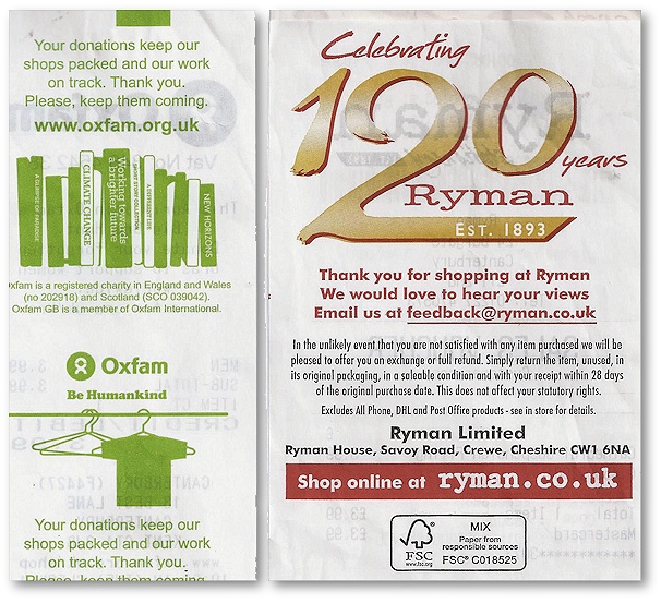
2. Car-parking ticket receipts with issuing authorities logos. Till-receipt backs are also worth attention and are often found printed in colour, for whilst individual receipts are printed in the machine itself at time of purchase the till rolls are pre-printed using conventional methods. How colour is used can vary considerably, from Oxfam's single green to the three colours of Ryman's 'Celebrating 120 years' [fig. 3] printed in black, red and pale buff. The familiar square matrix barcodes readable with a smartphone are also now making their appearance on till-receipt backs. 
3. Oxfam and Ryman Ltd receipt backs. Care is needed when handling newly acquired items as receipts are easily crumpled. Ironing after crumpling won't work for heat will completely smear the ink over the paper (as I know to my cost.) Two pieces of stiff card around 90 x 150mm held together with a spring clip are the answer. Easily carried in pocket or handbag they make a safe hideaway for new acquisitions on the otherwise hazardous journey home. An album with clear plastic pockets will be needed to display the collection. Ideally the pockets should be of archival quality but expense may be a deterrent here, and for the present one may simply use an A4 ring binder and the pockets available from any stationer. The collection can be transferred to archival presentation when funds allow. My preference is to mount on to an A4 white-paper base sheet in an overlapping arrangement as illustrated in figure 1 (though in practice I prefer the portrait rather than landscape format, which makes it easier to look through the album from page to page.) Good quality stamp hinges are used for mounting. Sometimes a receipt will be printed with an excess of white paper at the head and here I think it permissible to trim a little, but one should retain the whole of the printed details of purchase below as they constitute evidence, and thus could be of value to future social historians. Long receipts may be neatly folded under to facilitate the stamp-hinging of those that overlap. When mounting, leave at least some of the text visible beneath each heading so as to retain context; and here one can keep an eye out for interesting but temporary additions to the wording, examples being Oxfams 2015 Ebola Crisis Appeal or its Big Bra Hunt of April 2012. So there you have it, an aspect of ephemera so far largely overlooked and one, I think, with potential interest not only for the collector on a budget but for any ephemerist looking to extend his or her collecting to an additional field. *Following its primary definition as shoelace the OED describes 'shoestring' as 'a small or inadequate budget.' From this the society derives 'shoestring ephemera' - items that can be had often at no cost at all or at the most for less than a fiver, which should immediately ring a bell with students and others who can afford only a small outlay.
'Collecting on a shoestring' may also give ideas to established collectors keen to build up a worthwhile collection in a field previously overlooked. Articles already in the pipeline include private-view invitations, book markers, gallery tickets and cartes-de-visite. Understandably, some articles will focus on contemporary material (after all there's a lot of it about) but the inclusion of cartes-de-visite - the majority of which as seen in collectors' shops and fairs does still cost less than a fiver - is a reminder that collectable antique paper need not cost a fortune. Copyright © Graham Hudson 2016. All Rights reserved.
|
|
|
Home | News | About Us | Membership | Events | Links | Contact | Item of the month | Articles |
| Copyright © The Ephemera Society 2025. All Rights Reserved. |